

Have you ever had the feeling of looking at an interface and not knowing what is wrong with it?
Maybe you're a developer trying to make a better interface through code, or you're a designer doing a lot of testing with different colors, but you still haven't found what's wrong with the UI. Stay calm, this is totally normal and I will try to help you. 🐱🏍🐱👤
Before, it’s important that you notice that there is no secret or magic, it’s all about getting inspiration, practice, consistency and patience. In this article, I'm going to show you some things I used to do as a designer (and I keep doing it until now) to improve my UI design skills. I hope you find them useful. ✨
1- Simple visual changes can make a big difference
Most of the time the solution is in the small details as Steve Schoger - a visual designer - showed us in his famous project called Refactoring UI (a collection of small tips to improve our User Interface skills).
As Steve proved to us, basic design principles such as contrast, size and spacing are great allies when used correctly. That’s because sometimes you just need:
Less borders
While borders are great for distinguishing two elements from one another, they can make your interface look very busy. Box shadows, extra spacing between elements and different background colors can help to clear this up.
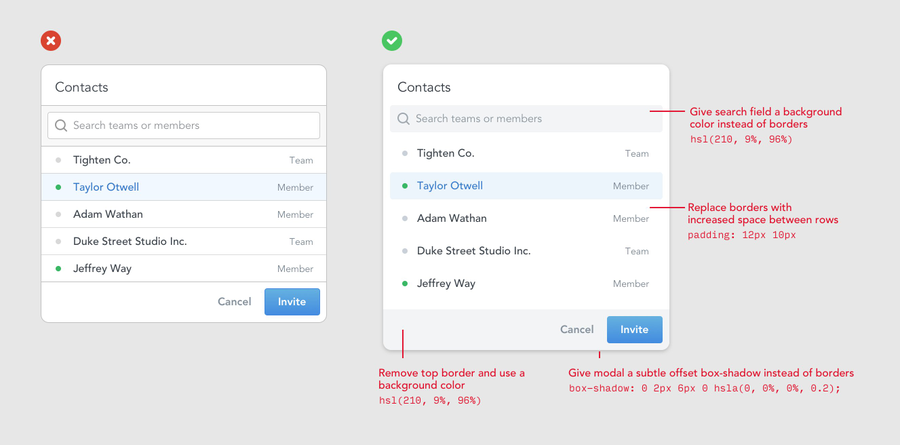
In addition, box shadows do a great job of outlining an element as a border and can be more subtle and less distracting.
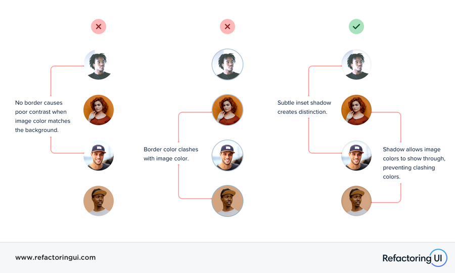
Think outside the database
There are many more ways to display information than simple lists and tables. Try to find creative solutions for common visual elements.
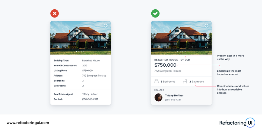
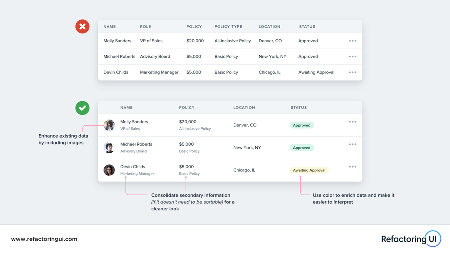
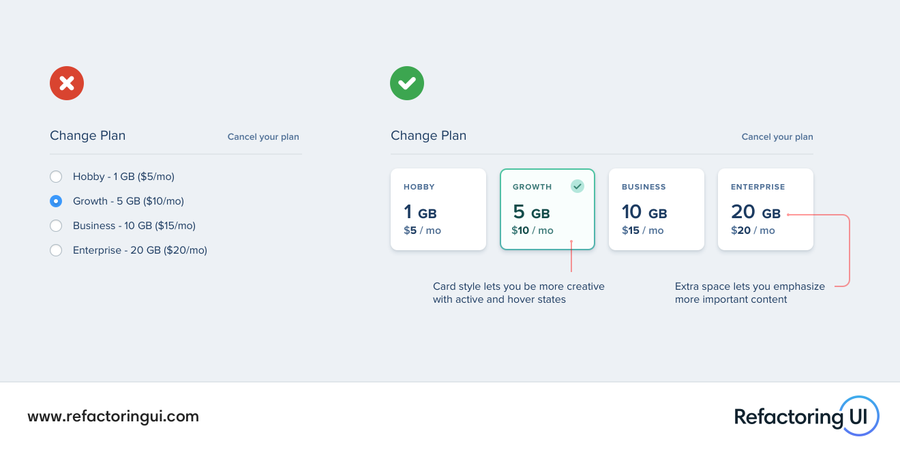
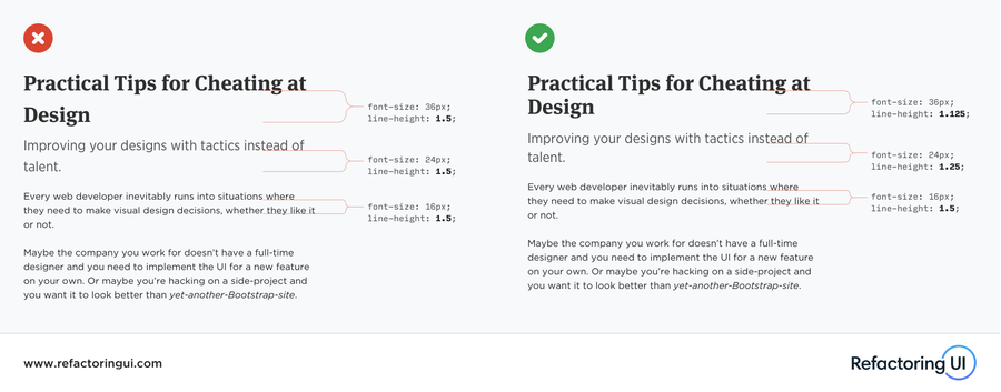
Focus on typography
Some user interfaces depend almost 100% on typography. So you should spend some time playing with font weight, size, color and other font attributes in order to improve the typographic hierarchy and its readability. As well as borders versus shadows, there are a few tricks you can do to build better interfaces by just changing the way you display textual content.
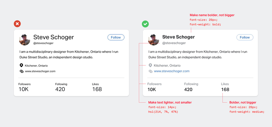
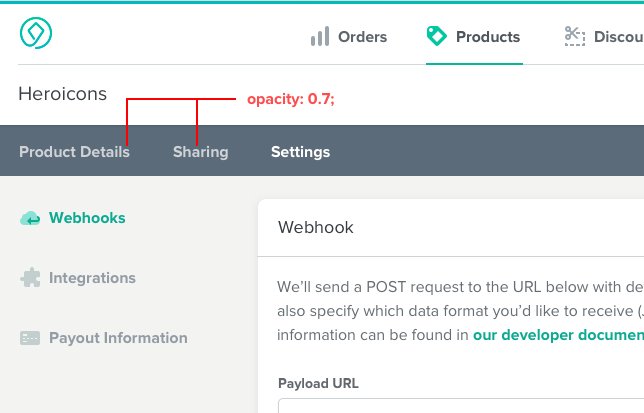
You shouldn’t use grey text on colored backgrounds
Gray colors are good when used on a white background, but don’t look good on colored backgrounds. In that case, choose a color that has the same hue as the background, adjusting its saturation and brightness - you can also simply decrease its opacity.

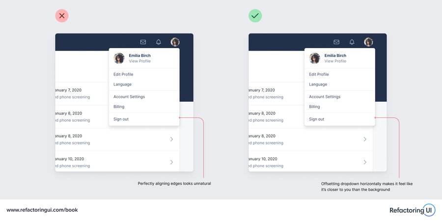
The alignment doesn’t need to be perfect all the time
Each effect is emulated just by choosing the correct technique. We can improve the elevated elements by combining a slightly offsetting with shadows.
And there are many more tips here.
2- Search for references and inspiration
As you already know that small details are very important in interfaces, it’s time to get familiar with some UI/UX design patterns and find creative ideas.
I believe that we can always learn from others. Therefore, I usually spend a lot of time analyzing some user interface patterns to understand the different design solutions commonly used for UI components.
For me, getting inspiration is the most exciting step in the design process. I like to find creative solutions and think about how I can also create these amazing interfaces. So, I try to identify every detail that the designer built and why he preferred to use this instead of that.
That’s the way to train our eyes for good design.
Sites of UI/UX design patterns for references:
Sites I like to get UI inspiration:
Keep in mind we don’t have to reinvent the wheel every single time trying to solve a particular design problem. We just need to find good references and find a reliable solution faster.
3- Practice and share your work
Practice makes masters, don’t you agree?
Some people believe that being a designer involves only talent, but I think that design is something that can be learned. Of course, some people have an easier time with codes and others with design, but with patience, dedication and a lot of practice, we can all achieve both skills.
Bellow are some tips you can use to improve your UI design skills:
Learn by copying great interfaces
This is not about plagiarism, it is just to practice.
By reading and copying other codes, developers learn and improve their skills a lot. In the same way, designers need to look at other designers interfaces to get more inspiration and learn new techniques and approaches.
Feel free to recreate some interfaces. It will provide you with a smart way to step out of your comfort zone and expand your visual design skills. When copying some design interfaces you love, you will pay attention to every detail. And there is the magic: check the small details; Do you remember?
Try to identify why you’re using some colors, buttons styles, white spaces, visual hierarchy, typography… Pay attention when spacing is better than borders, how box-shadows are being used, why some texts have negative letter-spacing or different line-height. There are so many things you can learn from copying other designs and it's awesome.
Apply your learnings and share your works
Now that you have the expertise to pay attention to details, the ability to train your eyes for good design, and have practiced a lot, it's time to improve your existing projects or try to build something new.
If you are a developer you can use all of the power of CSS to make amazing effects. If you are a designer you can go through some softwares to create fantastic prototypes, such as Adobe XD, Figma, Photoshop and others.
Useful CSS links for inspiration and learning:
- Codepen
- Tympanus/Codrops
- Modern CSS
- Style Stage
- 6 Powerful CSS Techniques You Can Use Instead of Javascript
CSS effects tutorials:
Adobe XD and Figma tutorials to improve your software skills:
Adobe XD
See more Adobe XD tutorials here.
Figma
See more Figma tutorials here.
Don’t be limited because of the technology, search a lot and find the best way to apply all you’ve learned and share your projects with others. By sharing your work you’ll get feedback that can help you continue improving your skills.
Conclusion
As I mentioned at the beginning of this article, it's all about getting inspiration, practice, consistency and patience. Try to make the search for inspiration a lifestyle. Every day, spend some time analyzing some sites, some effects and discovering some UI design decisions. Keep learning and applying what you have learned. Work hard.
I'm sure that in a few months, when you look back and see your progress, you'll be happy to have spent your time studying design. Feel free to find other resources, try to study some design principles and don't forget to share your work. 😃
And please tell me if this article was useful for you and leave in the comments some other tips and resources that you usually use. Until the next time! ✌

